BRAND
GUIDELINES
When using the Lantz logo in promotional materials, please follow these guidelines to ensure a consistent visual presentation of the company brand.
THE LOGO
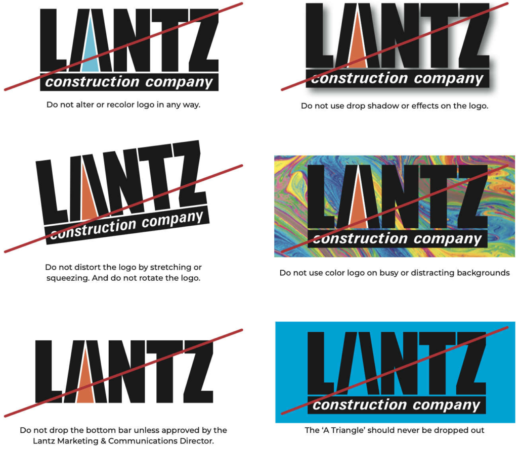
Consistency in the application of a company logo is crucial for brand awareness and perception. Please refer to the style guide below when utilizing Lantz’s logo. While there are options for applying the logo to most designs, the Lantz logo should not be altered in any way other than those specified here.
LOGO OPTIONS
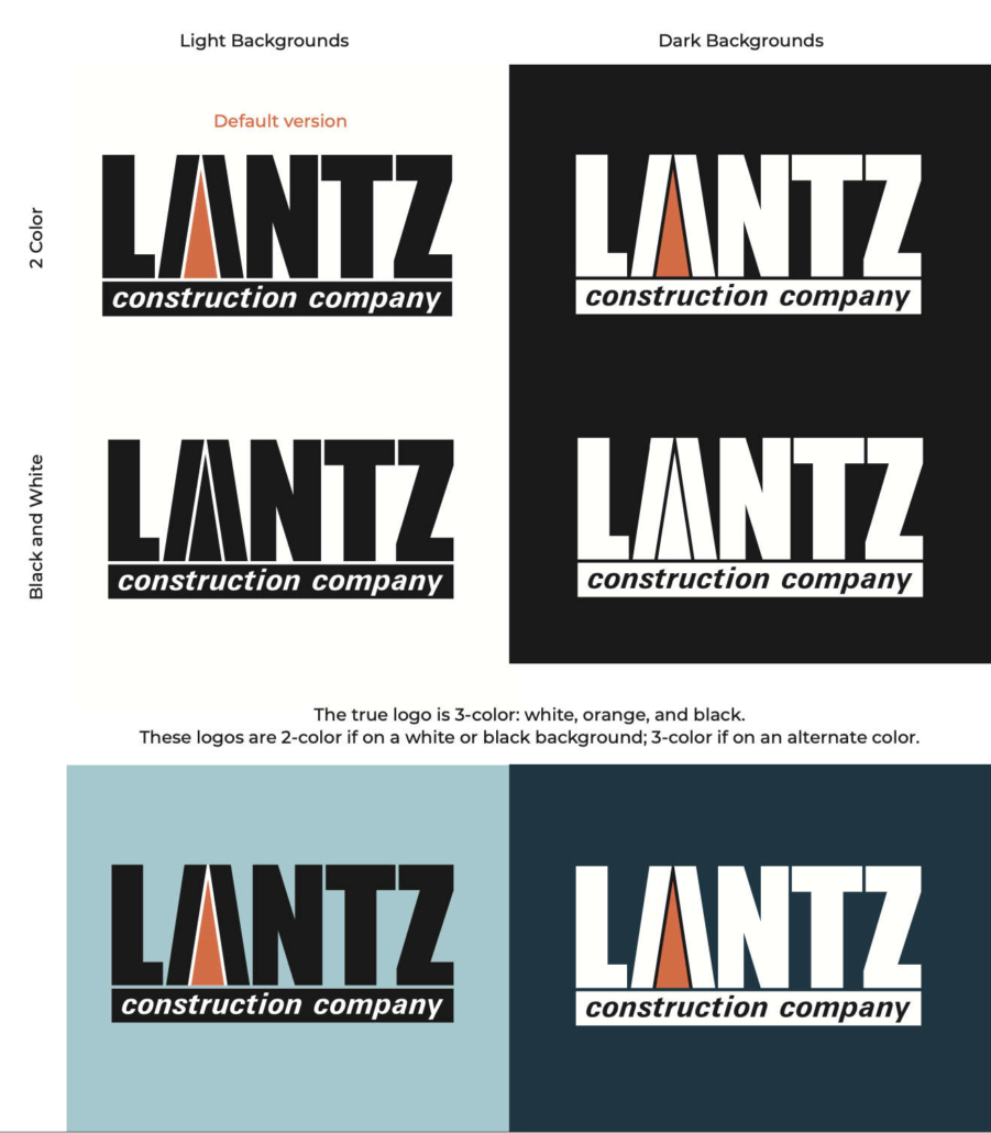
To increase brand awareness and improve perception, it is critical to apply the Lantz logo consistently and with care. These four versions are acceptable.
What file format to use and when
EPS : Encapsulated PostScript Vector based and thus allows usage on solid and transparent backgrounds. The file contains the 2 PMS colors. Download the Lantz logo in EPS:
- Color on White Background
- Color on Black Background
- Black on White Background
- White on Black Background
PNG : Portable Graphics Format Bitmap based on a transparent background. File is RGB color. Download the Lantz logo in PNG:
- [wpdm_package id=6174 template=”link-template-button.php”]
- [wpdm_package id=6166 template=”link-template-button.php”]
- [wpdm_package id=6163 template=”link-template-button.php”]
- [wpdm_package id=6157 template=”link-template-button.php”]
JPEG : Joint Photographic Experts Group Bitmap based on a solid background. File is RGB color. Download the Lantz logo in JPG:
- [wpdm_package id=6183 template=”link-template-button.php”]
- [wpdm_package id=6180 template=”link-template-button.php”]
- [wpdm_package id=6178 template=”link-template-button.php”]
- [wpdm_package id=6185 template=”link-template-button.php”]
CLEAR SPACE
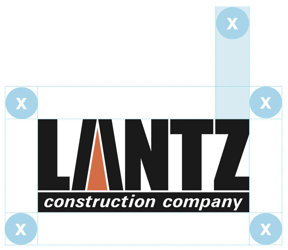
In order for the Lantz logo to be clearly legible in the context of surrounding graphics, information and logos, follow these guidelines for minimum clear space.
Clear space is determined by taking the width of the Z in the word Lantz. Then creating that much clear space on the left, right, top, and bottom margins.
MINIMUM SIZE
You should only use the logo’s minimum size when there is limited space available. The logo should never be smaller than these sizes.
INCORRECT USE
Here are some examples on how not to use our master logo.
TYPOGRAPHY
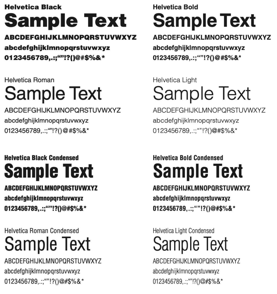
To maintain the integrity of the Lantz brand, please be consistent with the use of the font Helvetica throughout all communications where a custom font is acceptable.
When you are designing digital pieces, please use the system default typeface, Arial, so that you can guarantee accurate representation on every computer/digital device.
COLOR
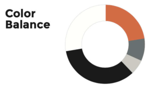
The Lantz colors are as important to the brand as the logo itself. They’re part of the brand’s personality, and consistent application will help reinforce it.
Important note
Digital screens are often not calibrated for color. Therefore, the look of the Lantz orange can vary depending on the device you are viewing it on. For true color matching please refer to a PMS swatch book. PMS 021
Primary Colors
PMS 021U
#ff6d2d
C 0
M 71
Y 86
K 0
R 255
G 109
B 45
Black
#000000
C 0
M 0
Y 0
K 100
R 35
G 31
B 32
White
#ffffff
C 0
M 0
Y 0
K 0
R 255
G 255
B 255

